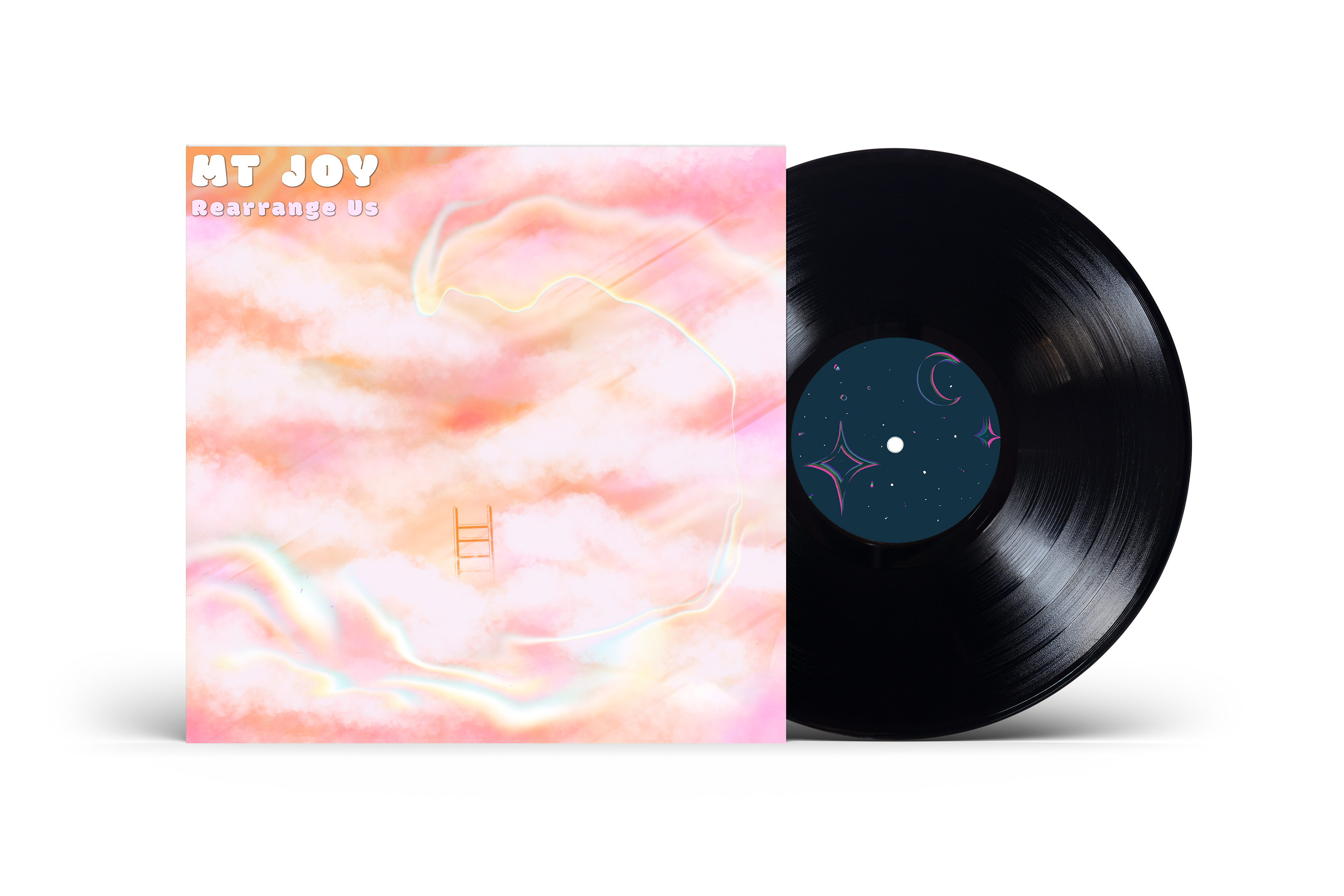
The cut and pasted feel of the type is meant to echo the album title "rearrange us". The imagery is of light, fluffy clouds and the typeface used is bubbly and cloud like but also rigid at the same time.
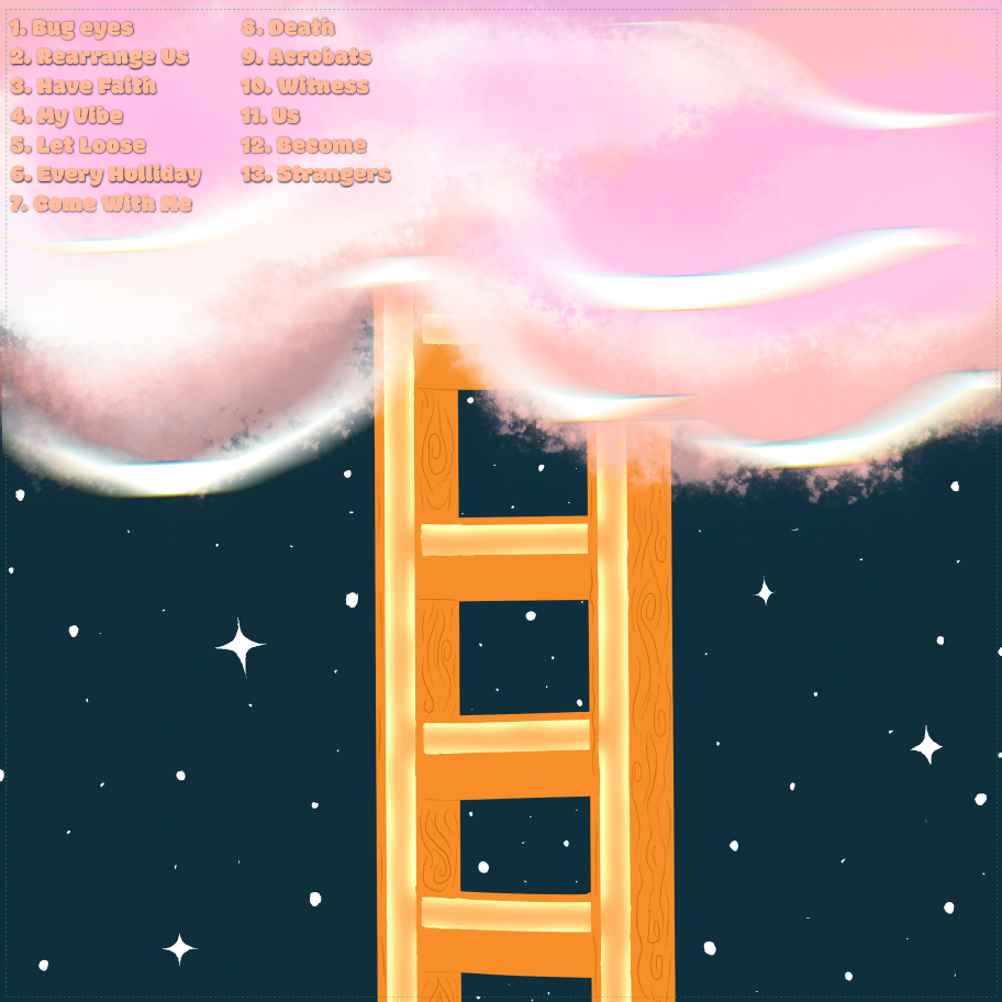
The back of the album is meant to be the beginning of the story when looking at both illustrations side by side. you have to go to the end to get to the beginning, and vice versa.
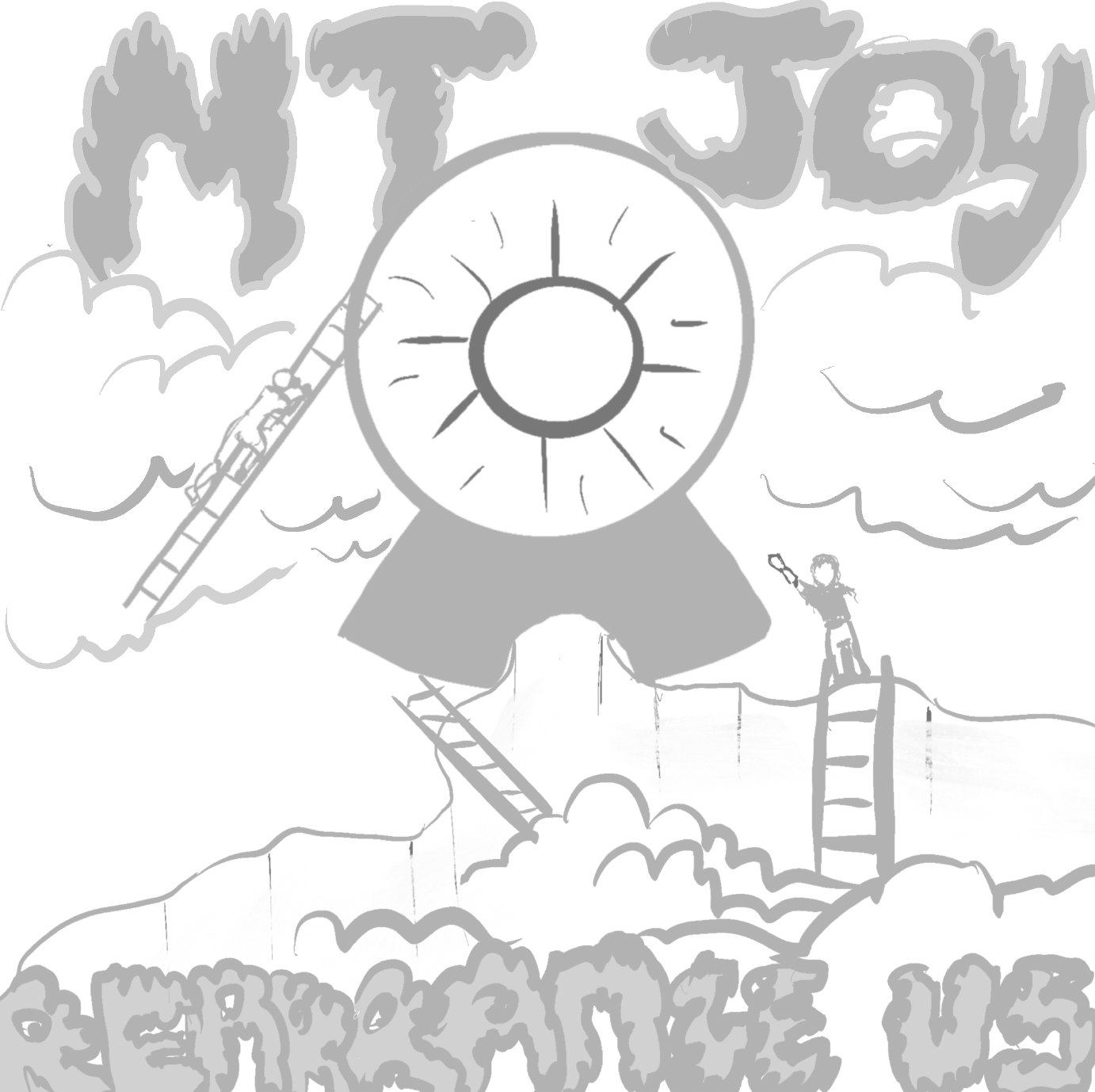
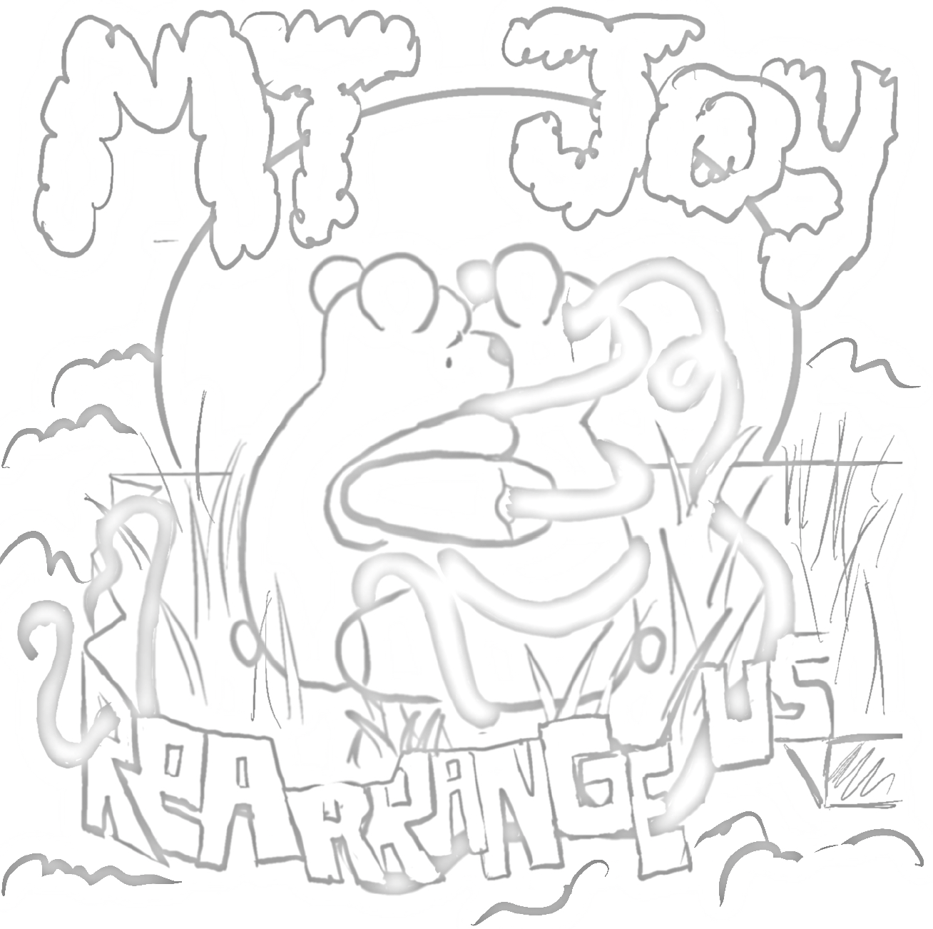
original sketches for the album cover. elements from each of these were put together to create the final version of the album.


